
Helping Financial Institutions Build Engaging Campaigns
TIME
Dec 2024 - May 2025


Case Study
Playbook Studio
ROLE
Product Strategy
Experience Design
User Research
Content Design
Financial institutions (FI) struggle to increase card usage because they lack tools for personalised marketing campaigns. The traditional process from campaign concept to launch are slow and inflexible, with large campaigns sometimes taking a year to arrive in the banking app.
Playbook Studio's inaugural feature, Early Month on Book (EMOB), aims to boost new cardholder engagement within 90 days through task-based rewards. Our core challenge was simplifying campaign setup and approval for bank employees.
GOALS
I designed Playbook Studio as a white-label solution that allows FI teams to build and manage engagement campaigns independently. The focus was on:
- Customisation – Giving FIs control over their messaging and branding.
- Clarity – Making campaign progress easy to understand for both FIs and cardholders.
- Efficiency – Reducing friction in content approvals and campaign setup.
RESEARCH INSIGHTS

Understanding Our Users & The Landscape
To really get to the heart of what our users needed, I spent about a month diving deep into the problem space. Right from the start, I stepped in to bridge a gap between our Product and Engineering teams. They each had very different ideas for the core design: Engineering favoured a completely blank canvas for total user flexibility, while Product wanted to make minimal changes to conserve resources, even though the original design lacked user research.
To resolve this, I proposed and led usability testing on both concepts with four existing customers (two "power users" and two more typical users). Alongside this, I also conducted a competitors’ analysis to spot emerging opportunities in the market. The findings were clear: the best user experience lay in a middle ground. This not only helped us find a superior solution but also brought the teams together, guided by real user insights. Pulling all these insights together, I concluded with four key takeaways that ended up guiding my design approach.
Navigation Issue

- Users found the information structure of the previous design overwhelming and suggested breaking it into smaller chunks.
UI Complexity

- The campaign builder on a blank canvas felt like technical mapping software, making it intimidating for non-technical users.
Content Editing Needs

- Users wanted a live preview to see how their content would appear before launching.
Approval Bottlenecks

- Approvals required multiple rounds of feedback, but there was no clear way to track comments and edits.


Design for Control
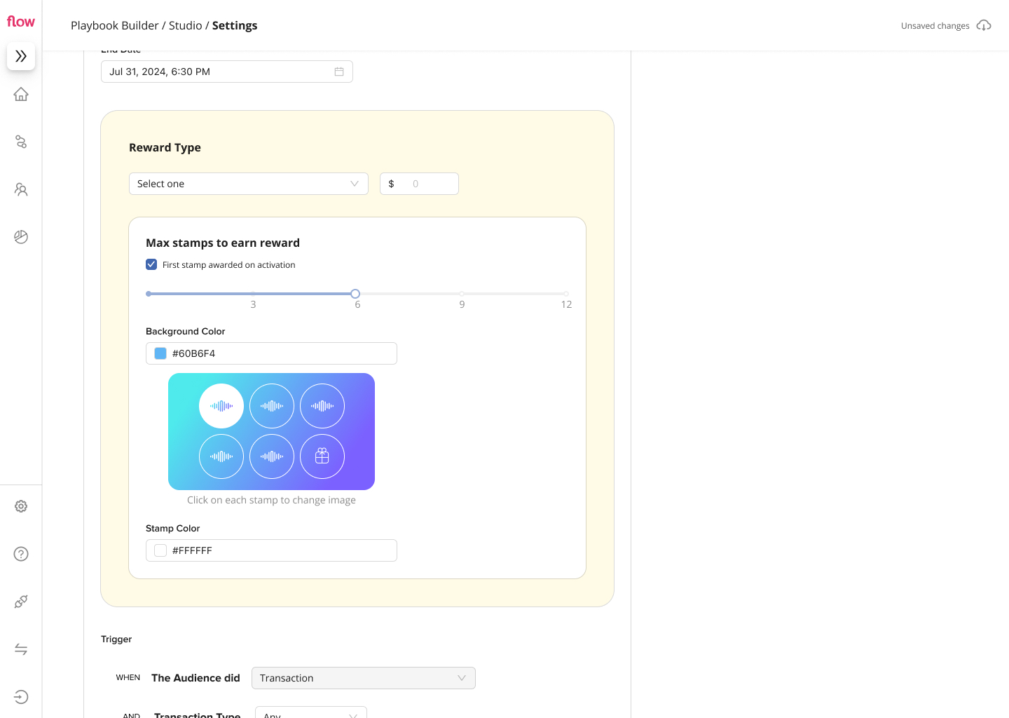
Campaign Settings
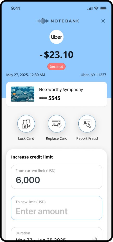
- Core Settings: Marketing teams configure the campaign's essentials: duration, rewards, and transaction triggers.
- Clear Dates: Simple fields for start/end dates eliminate timing confusion.
- Flexible Rewards: Customisable structures allow diverse incentive types.
- Transaction Filters: Specify qualifying purchases for targeted campaigns.

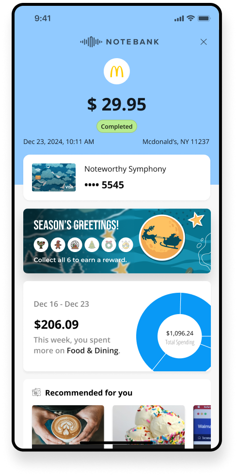
Email Notification Editor
- Personalised Messaging: Issuers customise cardholder emails using templates with default text, images, and variables for hyper-personalisation.
- Interactive Preview: Real-time rendering shows changes as they are made, ensuring brand consistency and quick customisation.
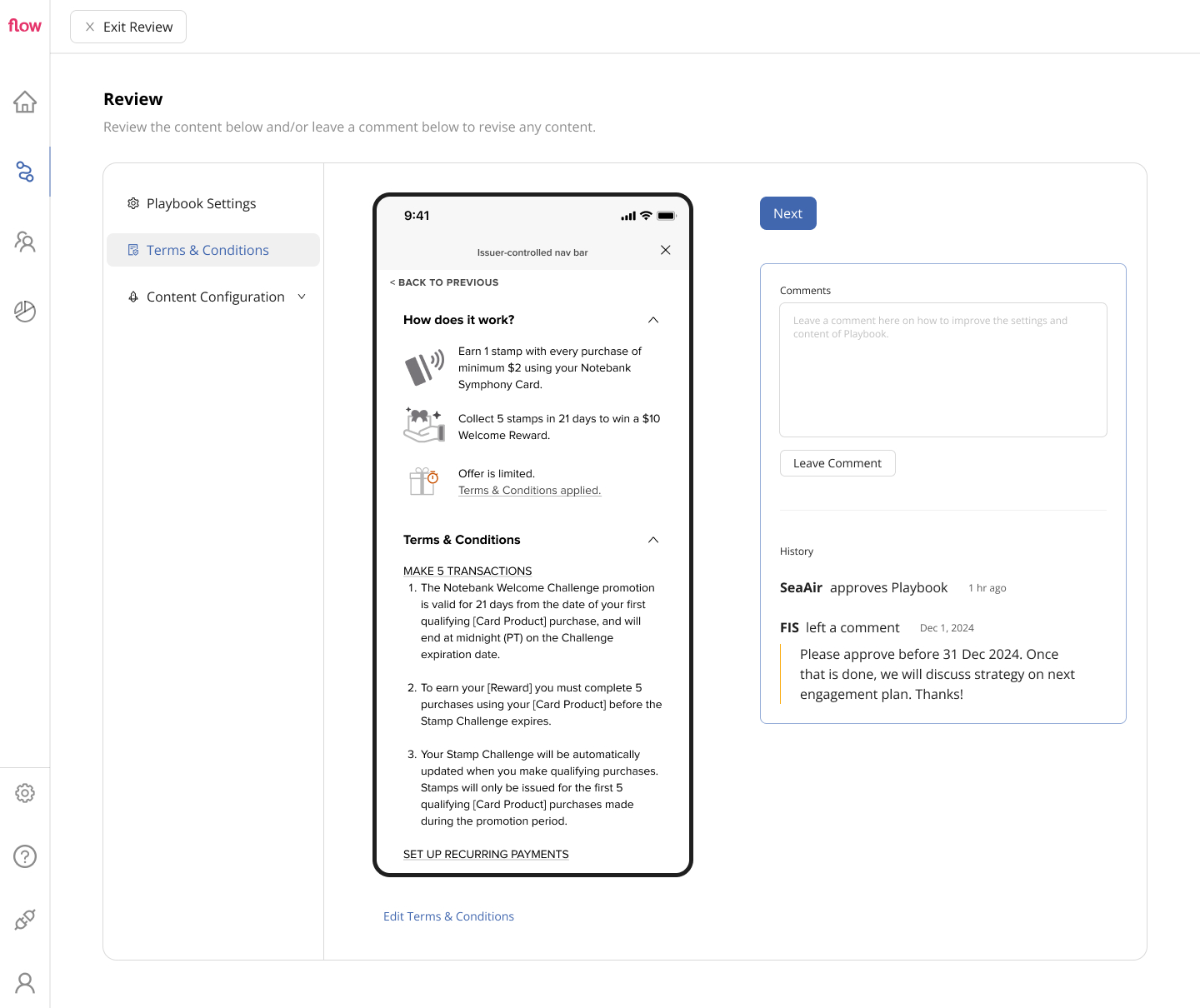
Terms & Conditions Approval
- Streamlined Review: Issuer teams review T&Cs directly with their Legal/Compliance departments.
- Built-in Feedback: A commenting system allows direct feedback and change requests, reducing back-and-forth emails.
Final thoughts
From 1 year to 1 month
By focusing on customisation, clarity, and efficiency, Playbook Studio simplifies campaign creation for FI employees and partners - reducing time needed for a campaign to go live.
Playbook Studio resolves navigation issues from the previous design, reduces setup time, and makes approvals seamless. EMOB is just the beginning — this flexible framework will support more engagement strategies in the future, including an upcoming Formula 1 campaign spearheaded by a large global bank.
Other work

Corporate Wellness Lifestyle App
Supporting organisational wellness through better education and engagement in employees’ mental, physical, financial and social health.
See Project →
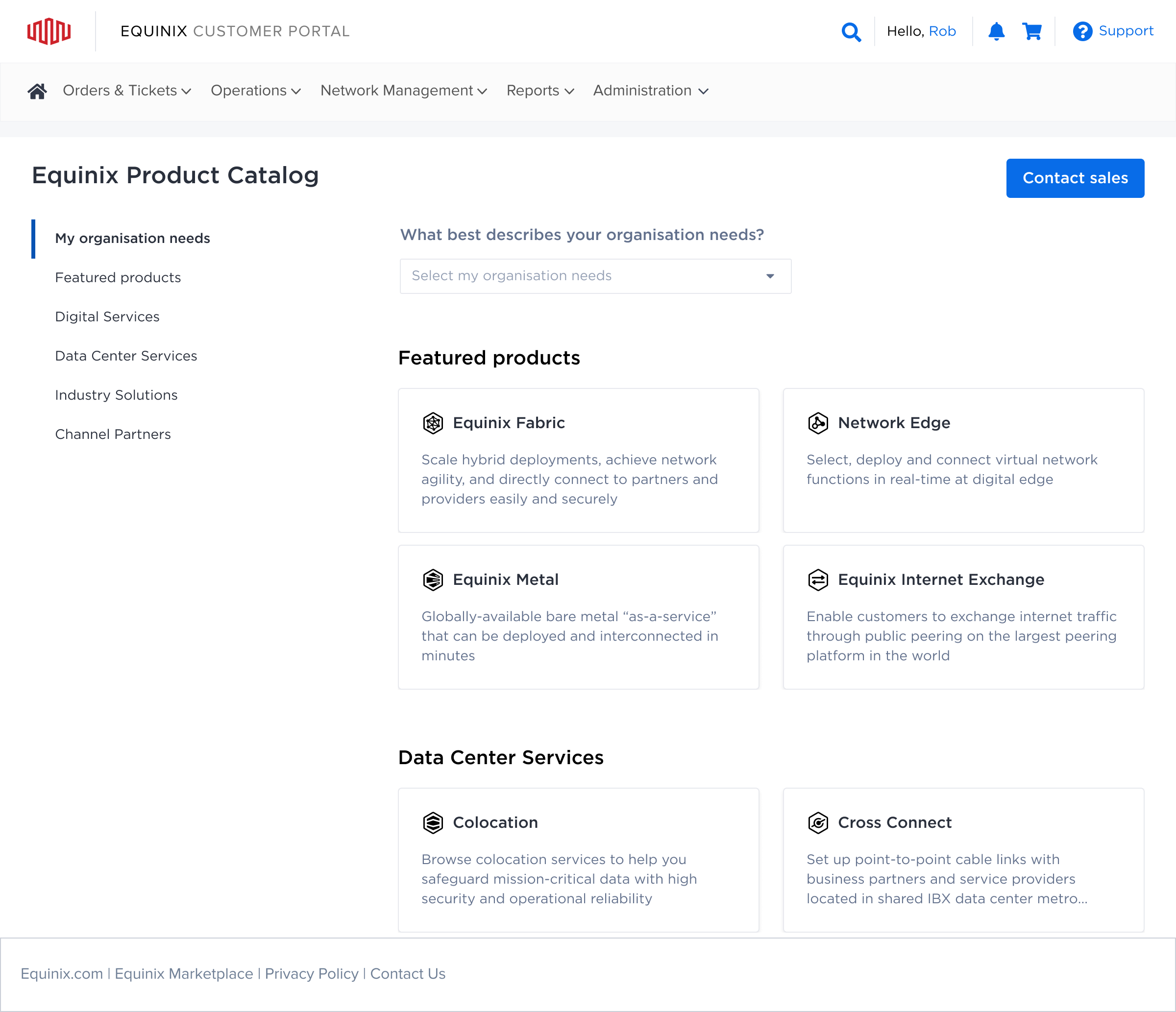
B2B Digital Product Catalog
Helping customers navigate complexity to find the right digital infrastructure for their connectivity needs.
See Project →

Connect with me to explore your project's potential.


CONTACT
mytheoism@gmail.com
SOCIAL
Helping Financial Institutions Build Engaging Campaigns
TIME
Dec 2024 - May 2025
Case Study
Playbook Studio
ROLE
Product Strategy
Experience Design
User Research
Content Design
Financial institutions (FI) struggle to increase card usage because they lack tools for personalised marketing campaigns. The traditional process from campaign concept to launch are slow and inflexible, with large campaigns sometimes taking a year to arrive in the banking app.
Playbook Studio's inaugural feature, Early Month on Book (EMOB), aims to boost new cardholder engagement within 90 days through task-based rewards. Our core challenge was simplifying campaign setup and approval for bank employees.
GOALS
I designed Playbook Studio as a white-label solution that allows FI teams to build and manage engagement campaigns independently. The focus was on:
- Customisation – Giving FIs control over their messaging and branding.
- Clarity – Making campaign progress easy to understand for both FIs and cardholders.
- Efficiency – Reducing friction in content approvals and campaign setup.
RESEARCH INSIGHTS
Understanding Our Users & The Landscape
To really get to the heart of what our users needed, I spent about a month diving deep into the problem space. Right from the start, I stepped in to bridge a gap between our Product and Engineering teams. They each had very different ideas for the core design: Engineering favoured a completely blank canvas for total user flexibility, while Product wanted to make minimal changes to conserve resources, even though the original design lacked user research.
To resolve this, I proposed and led usability testing on both concepts with four existing customers (two "power users" and two more typical users). Alongside this, I also conducted a competitors’ analysis to spot emerging opportunities in the market. The findings were clear: the best user experience lay in a middle ground. This not only helped us find a superior solution but also brought the teams together, guided by real user insights. Pulling all these insights together, I concluded with four key takeaways that ended up guiding my design approach.
Navigation Issue
- Users found the information structure of the previous design overwhelming and suggested breaking it into smaller chunks.
UI Complexity
- The campaign builder on a blank canvas felt like technical mapping software, making it intimidating for non-technical users.
Content Editing Needs
- Users wanted a live preview to see how their content would appear before launching.
Approval Bottlenecks
- Approvals required multiple rounds of feedback, but there was no clear way to track comments and edits.


Design for Control
Campaign Settings
- Core Settings: Marketing teams configure the campaign's essentials: duration, rewards, and transaction triggers.
- Clear Dates: Simple fields for start/end dates eliminate timing confusion.
- Flexible Rewards: Customisable structures allow diverse incentive types.
- Transaction Filters: Specify qualifying purchases for targeted campaigns.
Email Notification Editor
- Personalised Messaging: Issuers customise cardholder emails using templates with default text, images, and variables for hyper-personalisation.
- Interactive Preview: Real-time rendering shows changes as they are made, ensuring brand consistency and quick customisation.
Terms & Conditions Approval
- Streamlined Review: Issuer teams review T&Cs directly with their Legal/Compliance departments.
- Built-in Feedback: A commenting system allows direct feedback and change requests, reducing back-and-forth emails.
Final thoughts
From 1 year to 1 month
By focusing on customisation, clarity, and efficiency, Playbook Studio simplifies campaign creation for FI employees and partners - reducing time needed for a campaign to go live.
Playbook Studio resolves navigation issues from the previous design, reduces setup time, and makes approvals seamless. EMOB is just the beginning — this flexible framework will support more engagement strategies in the future, including an upcoming Formula 1 campaign spearheaded by a large global bank.
Other work
Corporate Wellness Lifestyle App
Supporting organisational wellness through better education and engagement in employees’ mental, physical, financial and social health.
See Project →
B2B Digital Product Catalog
Helping customers navigate complexity to find the right digital infrastructure for their connectivity needs.
See Project →

Connect with me to explore your project's potential.


CONTACT
mytheoism@gmail.com
SOCIAL
Helping Financial Institutions Build Engaging Campaigns
TIME
Dec 2024 - May 2025
Case Study
Playbook Studio
ROLE
Product Strategy
Experience Design
User Research
Content Design
Financial institutions (FI) struggle to increase card usage because they lack tools for personalised marketing campaigns. The traditional process from campaign concept to launch are slow and inflexible, with large campaigns sometimes taking a year to arrive in the banking app.
Playbook Studio's inaugural feature, Early Month on Book (EMOB), aims to boost new cardholder engagement within 90 days through task-based rewards. Our core challenge was simplifying campaign setup and approval for bank employees.
GOALS
I designed Playbook Studio as a white-label solution that allows FI teams to build and manage engagement campaigns independently. The focus was on:
- Customisation – Giving FIs control over their messaging and branding.
- Clarity – Making campaign progress easy to understand for both FIs and cardholders.
- Efficiency – Reducing friction in content approvals and campaign setup.
RESEARCH INSIGHTS
Understanding Our Users & The Landscape
To really get to the heart of what our users needed, I spent about a month diving deep into the problem space. Right from the start, I stepped in to bridge a gap between our Product and Engineering teams. They each had very different ideas for the core design: Engineering favoured a completely blank canvas for total user flexibility, while Product wanted to make minimal changes to conserve resources, even though the original design lacked user research.
To resolve this, I proposed and led usability testing on both concepts with four existing customers (two "power users" and two more typical users). Alongside this, I also conducted a competitors’ analysis to spot emerging opportunities in the market. The findings were clear: the best user experience lay in a middle ground. This not only helped us find a superior solution but also brought the teams together, guided by real user insights. Pulling all these insights together, I concluded with four key takeaways that ended up guiding my design approach.
Navigation Issue
- Users found the information structure of the previous design overwhelming and suggested breaking it into smaller chunks.
UI Complexity
- The campaign builder on a blank canvas felt like technical mapping software, making it intimidating for non-technical users.
Content Editing Needs
- Users wanted a live preview to see how their content would appear before launching.
Approval Bottlenecks
- Approvals required multiple rounds of feedback, but there was no clear way to track comments and edits.

Design for Control
Campaign Settings
- Core Settings: Marketing teams configure the campaign's essentials: duration, rewards, and transaction triggers.
- Clear Dates: Simple fields for start/end dates eliminate timing confusion.
- Flexible Rewards: Customisable structures allow diverse incentive types.
- Transaction Filters: Specify qualifying purchases for targeted campaigns.
Email Notification Editor
- Personalised Messaging: Issuers customise cardholder emails using templates with default text, images, and variables for hyper-personalisation.
- Interactive Preview: Real-time rendering shows changes as they are made, ensuring brand consistency and quick customisation.
Terms & Conditions Approval
- Streamlined Review: Issuer teams review T&Cs directly with their Legal/Compliance departments.
- Built-in Feedback: A commenting system allows direct feedback and change requests, reducing back-and-forth emails.
Final thoughts
From 1 year to 1 month
By focusing on customisation, clarity, and efficiency, Playbook Studio simplifies campaign creation for FI employees and partners - reducing time needed for a campaign to go live.
Playbook Studio resolves navigation issues from the previous design, reduces setup time, and makes approvals seamless. EMOB is just the beginning — this flexible framework will support more engagement strategies in the future, including an upcoming Formula 1 campaign spearheaded by a large global bank.
Other work
Corporate Wellness Lifestyle App
Supporting organisational wellness through better education and engagement in employees’ mental, physical, financial and social health.
See Project →
B2B Digital Product Catalog
Helping customers navigate complexity to find the right digital infrastructure for their connectivity needs.
See Project →

Connect with me to explore your project's potential.


CONTACT
mytheoism@gmail.com
SOCIAL